Increasing Your Add to Carts
Tip # 1 – Coloured Add to Cart Buttons
What is THE most important button your website? What is THE one place you want users to click? Your add to cart button! Your product pages may have beautiful imagery, excellent descriptions, it can all look super gorgeous but if you add to cart button doesn’t stand out then it can often be overlooked.
Asos

The Iconic

Adore Beauty

Just take a look at these CTA (Call to Action) Buttons by large retailers. There’s a reason why they’re coloured – they stand out and they’ve probably spent a bucket load of cash on the psychology behind online shopping. Try it for yourself and see whether you see an increase in conversion rates!
You may be thinking “but I don’t have a colour in my branding?” or “my colours are ugly”. Then why not test out some of these shades below and see the difference for yourself!


Extra Tip : Make sure you use white font when using a coloured background to your CTA button!
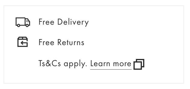
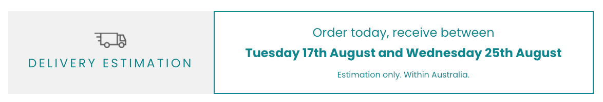
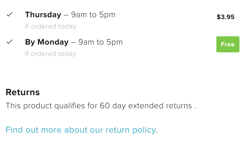
Tip # 2 – Being clear about shipping costs & shipping timing
Being super clear about your shipping costs and shipping timing on your product page is super important. You’ve got to hold the hands of your website visitors on their journey. No one likes surprise shipping costs or surprise long delivery times. This doesn’t mean that you have to cut your shipping charges or abandon ship if you have lengthy delivery times, you just have to be really open with your users.
Simply pop in clear, easy to digest information on your product page like so :
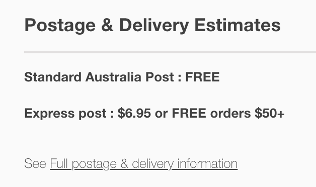
Want to go extra fancy? Ask you developer to code in something that provides an estimated delivery date! (Even better work with our favourite female owned digital agency Gurl to help!)
Tip # 3 – Creating a “Landing Page” experience for your product pages
You may have heard the term “landing page” thrown around in relation to a page that is designed to convert. Typically used by companies who want to provide you a hard sell, you’ll see an increase in your add to carts by taking this concept but refining it.
Gone are the days where a product page consists of the product image on the left, product name, price and add to cart on the right and then a short description underneath. It’s time to go all out!
Being inspired by the landing page concept on your product page can be a timely exercise but if you’re a small retailer with less than 20 products then there is no reason why you can’t implement on each of your products.
Take the popular footwear retailer Allbirds… Each of their product pages has the flow described above in place – images on left and on the right is the title, price and the add to cart section… Then underneath, they’ve used some awesome imagery with key text to further sell each of their designs.
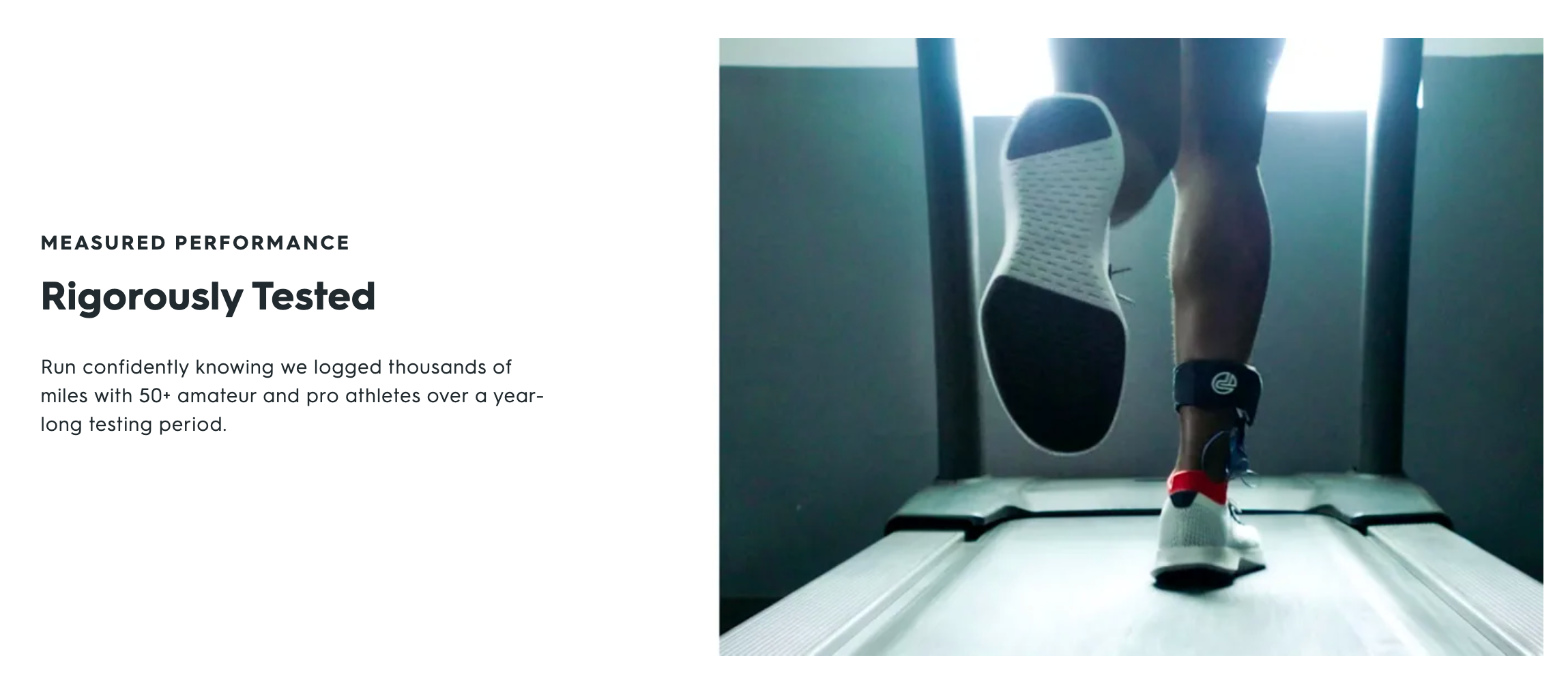

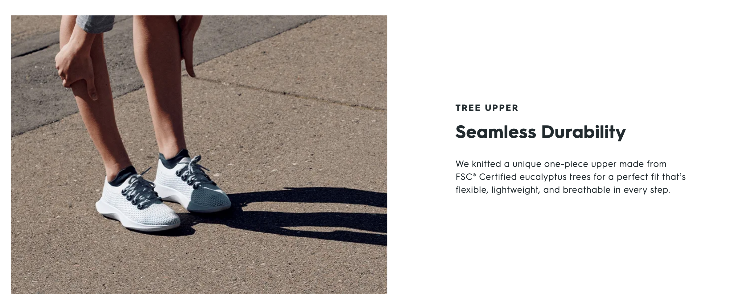

By the time you’ve digested all of their amazing product photography and key reasons why you need their shoes, you’ve got a cart full and you’re asking yourself if it’s ok to buy a pair for each day of the week.
By breaking out into this type of landing page experience, you’re able to showcase your imagery as not all users will browse through all of your product imagery at the top of your product page. You can also showcase your finest copy skills to highlight features of your products.
Being inspired by the landing page/hard sell concept doesn’t mean you have to have ten thousand flashing GIFs or your top 10 reasons of why you’ll shed half your body fat in 10 days. Landing page inspired product pages can be soft, nurturing and can help you to hold the hand of your user, increasing the likeliness of adding to cart. Wahoo!
NEXT STEP
![]()
![]()
![]()
This article was brought to you through the help of Gurl.com.au – they’re a 100% female owned & operated Melbourne based Digital Agency and Shopify Partners specialising in helping online retailers grow their businesses.
Female Owned Official ID : #AU0005